When it comes to responsive web design Melbourne digital agencies, Digiwhiz is at the forefront of helping business establish their unique brand through the careful strategising and crafting of responsive website solutions.
Responsive web design melbourne: ensure your website is the best it can be

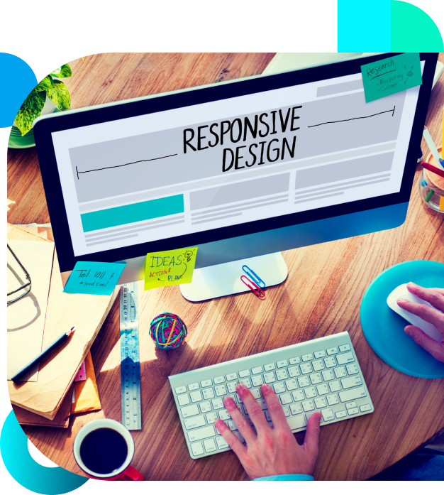
What is Responsive Web Design?
In past, businesses required a mobile version of their website, but responsive web design completely removes this need. And given the many ways customers interact with the web, businesses have come to realise responsive web design is now essential.
Responsive web design is as simple as it sounds: the capacity for webpages to respond quickly to user interactivity and behaviour. This means webpages always look their best in any browser and on any device or screen. This comes on the back of an unprecedented increase in mobile browsing, meaning the capacity for responsive websites to accommodate different screens, platforms and orientations are imperative for any business’s website. And because responsive websites are completely user-focused, they respond instantly to user browsing needs.
Create an engaging user experience through a Responsive Website
As your digital partner, Digiwhiz will work hard to translate your creative ideas into reality. Our expert responsive web design Melbourne team is completely focused on helping you implement your business strategy through your responsive website, with an emphasis on:
- Increased conversions
- Greater user engagement
- Site content being SEO and Google-friendly
- Platform independence, meaning regardless of the CMS you use, the website will function optimally.
So, don’t be left with an inferior website that users turn away from. If you’re looking for a competitive responsive web design Melbourne digital partner, Digiwhiz is your one-stop solution.
Benefits of responsive web design and development


Responsive to Increased Mobile Traffic
Increased web usage via mobile devices creates the need to have optimised webpage layouts. Responsive website design provides greater versatility across many devices at a lower cost for your business.

Increased Content Velocity
Content velocity – the ability to discover, manage, create, personalise, deliver and measure performance of content at scale and speed – is maxmised with responsive web design.

Image Optimisation
Responsive web design optimises images according to user browser and device, which means you will never have issues with display.
Our web design process

Gaining an Intricate Understanding of Your Business
The first step in our web design process is identifying what lies at the heart of a web design project, so careful consideration of your business goals, your audience, business triggers and other important factors is undertaken.

User Experience and Interactivity
The key to optimising user experience is building into your web design simple conversion instructions, an easily navigable layout and clear labelling. After gaining a thorough understanding of your business, our web design company Melbourne UX team plans out a sitemap, which is the blueprint for your site and enables us to generate a wireframe. The wireframe is important because it is used to lay out content and functionality that takes into account user needs and journeys. During the design process, all static pages from the website are mocked-up to give you a sense of what the final product will look like and how it will act.

Visual Design Delivery
Once the wireframe is built out, our team works on the page layout based on the wireframe, with a clear focus on SEO-friendly content using higher levels of application-focused tools to ensure your site ranks higher in search.
Success Stories: Discover why we do well in the industry
Real Promises, Real Results, Real Growth


Talk to a full-service digital marketing agency about your business goal
At Digiwhiz, we’re passionate about helping businesses reach their maximum potential online. Tell us a little about your brand and what you hope to achieve, and we’ll be in touch to discuss how we can help you grow.


